
10 Responsive Web Design Do’s and Don’ts
Responsive web design (RWD) seems very appealing but venturing into the world of multiple screen sizes, media queries, and mobile-first can be daunting. Fear not, however. JDM Digital has put together a list of the top 10 Do’s and Don’ts to guide you through the treacherous waters of modern responsive website and email design.
The Responsive Web Design Backstory
“Make my site mobile-friendly!” It’s a pretty common demand in today’s post-PC world. For the first time in 2014, comScore reported mobile web browser had eclipsed desktop browsing globally.
google-responsive-devicesSure, you could build an iOS app, an Android app, and a Windows 8 app to browse your site, but each of them will cost around $8K and you still require users to download said app. Get real.
Responsive Web Design (or RWD, for short) is all the rage precisely because it’s just good old fashioned HTML with the CSS you’ve come to know and love and a little magic using something called “media queries”, introduced in CSS3. Media queries simply allow you to query the screen size (the ‘media’, if you will) and update the style (CSS) in real time.
That means, you can have two columns that are 50% of the width of a screen floated side-by-side until that screen is smaller than, say, 768px. At widths smaller than 768px, the columns are both 100% wide and stacked one on top of the other. That’s responsive web design in a nutshell.
10. DON’T Do it Because it’s Trendy
Responsive web design is all the rage, but don’t do it just because it’s trendy. Think about how your user will browse your site on their mobile device and, perhaps more importantly, WHY. Are they looking for your dinner menu, your office location, your phone number, reading your awesome blog, looking for examples, researching vendors?
Whether mobile, tablet, or desktop, your website visitors don’t care about trendy whiz-bang. Get to the point.
09. DO Use Large Fonts
On a desktop, you’re used to reading content in 12-point font on a 22-inch monitor. Mobile users can’t read that tiny font on their phones. You need to use much larger font sizes. In fact, increase your smallest font size to something you think is borderline TOO big. Then, add 1 more point. As a rule of thumb, yourfont size should be no smaller than 16px (if you’re still using pixels for responsive typography).
08. DON’T Hide Content for Mobile
There’s no need to punish mobile users by hiding some of your content or, worse, showing a stripped-down version of your website. Stick to a mobile-first design strategy (design for mobile, THEN scale things up for tablet, laptop, and desktop devices). More on that in #1, at the bottom.
07. DO Keep User Experience (UX) in Mind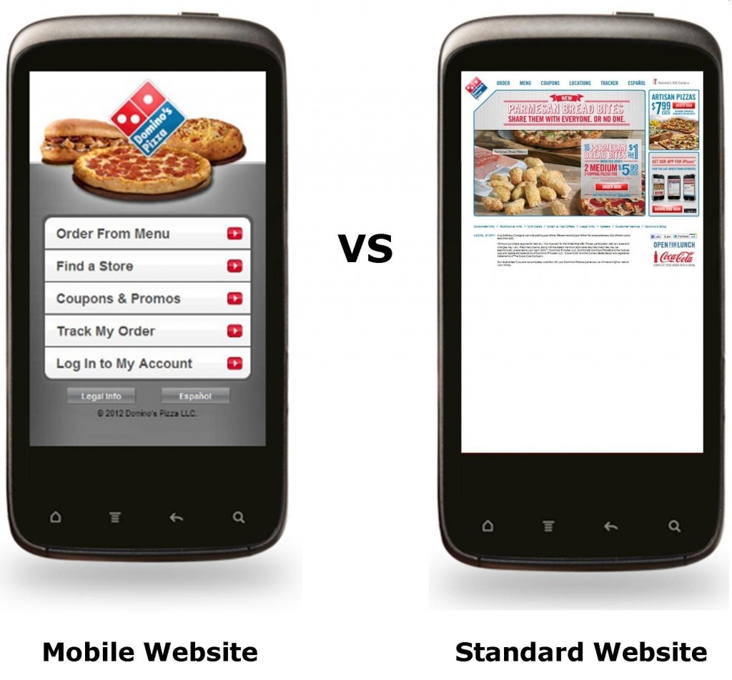
Just because you “can” do something, doesn’t mean you “should.” Keep the user in mind. Would this functionality be beneficial to THEM? Remember, your visitors don’t give a sh*t that your site is responsive. They may not even know what that means. For a little extra credit, check out Google’s 3 Things.
06. DON’T Clutter the Design
From garbage sidebars to multiple navigation planes, you’d be surprised how much of your website’s UI you can do without. It’s a painful process (trust us, we know), but try to remove HALF of everything on a given page. Then, remove HALF of what remains. That’ll keep you designs clean and clear.
05. DO Keep it Light and Fast-Loading
Even with 4G mobile networks covering most of Canada and the U.S., mobile devices are still far slower and bandwidth more expensive than desktop. You need to keep your responsive site as light as possible. Keep in mind, the biggest problem with responsive is that it’s not (yet) adaptive. In other words, that giant background image on your home page is the same if I’m viewing it on my 35-inch HD desktop display as on my tiny iPhone 5. A truly optimized asset is an asset never downloaded.
04. DON’T Use Tiny Links
A mouse was DESIGNED for great granular control and a finger is a pretty horrible pointing device. Keep your line-height at least 1.4 and your body font size at least 16px. Buttons and navigation links should also have at least 8 pixels of padding and 15px of margin around them, for those of us with fat fingers.
03. DO Test, Test, Test
Designing a mobile site requires prioritization. The only way to prioritize is by measuring and testing your design to ensure they support these critical tasks. Look into User Experience testing for real-world tests on your designs while still on a staging server. One of my favorites is UserTesting.com. They also have a free trial version called “Peek” for those of you a little apprehensive about UX testing.
02. DON’T “Build the Lily”
Something as beautiful as a Lily doesn’t need to be recreated. Try to adhere to certain design conventions whenever possible. That’s what people are used to seeing and interacting with. Google, for one, came up with their own UI design convention they named “Material Design.” Not that “Material Design” is the end-all and be-all. Just stick to the classics, unless you’ve got a really good reason to depart from those conventions. Even then, remember, the Lily was perfect before you tried to improve it.
01. DO Design “Mobile-First”
We’ve mentioned this before, but I think it bears mentioning again. Don’t start designing your new mobile-friendly site for desktop and then try and cram it into a mobile device. You need to do it in reverse, ergo, “mobile-first.” Start by designing a full-featured responsive website for mobile and then scale it UP for tablets, netbooks, and desktops. As you move up, your images could get larger (loads a separate, larger image src), your page could get a little heavier (if it must), and your navigation could return to something a bit more “mouse-friendly.”