
4 Steps to a Seductive Website
Make visitors love your website by using these 4 expert tips
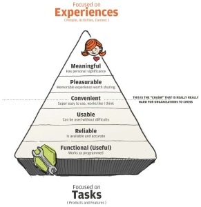
Illustration by Ben Jordan: https://twitter.com/benjordan
The arts of seduction and interaction design go hand-in-hand. Your goal, after all, is making the user fall in love with your website or application.
The same principles of courtship apply: trying too hard repulses the user, while not trying enough will make them pass you over.
In this article, we’ll show how to take advantage of human psychology and emotional design to create an alluring charm to your interface.
1 – Create an inspiring flow
An alluring interface is designed to put the user in a state of flow — a mindset in which they are so focused on interacting with your product, they forget the rest of the world. Mihaly Csikszentmihalyi, in his book Flow, explains that this is the optimal experience because the user focuses on their work, and the interface becomes only an invisible hand guiding them along.
The way to inspire flow is to constantly and rewardingly engage the user — “seducing them,” in other words. To create such an experience, at least two factors are needed:
- Control — The user must feel in control the entire time. This is why seduction favors subtlety over aggressive approaches.
- Achievement — Obviously, the user needs a purpose for using your product, whether business or pleasure. Beyond the main goal, the sense of achievement can be bolstered by positive and well-placed feedback from the system.
While a simplistic viewpoint of the much more complex field of interaction design, creating this “flow” in your users is a nice, simple goal to chase throughout the rest of the design process.
2 – Understand your users
 The first step is understanding as much as possible about people.
This list of observations about individuals as a whole leads the way to interaction designs that give people what they want. From this list, we can derive a list of elements that will make your website or app more attractive to the common person.
- Social Proof — Most people follow popular opinion, so if your product seems popular, its perceived value increases. If you don’t have the numbers to parade openly, even a few considerate testimonials will help.
- Scarcity — Just like an exclusive club, scarcity adds the allure of something not everyone can have. Offering limited promotions or even a private, invitation-only beta version of the product can generate more excitement from non-users than the users themselves.
- Recognition over Recall — As we explained in Interaction Design Best Practices, the more the user must think, the less they’ll enjoy the product. Design your interface with recognizable patterns so users don’t need to relearn basic controls. For example, link text should be labelled the same as the headlines of the linked content.
- Sensory Integration — Stimulating more of your users’ senses will engage them deeper. Aside from visuals, this can only apply to audio effects/music, or some creative use of gesturing in mobile devices. For example, the Wunderlist app plays a pleasant bell chime when you complete a task.
- Visual Superiority — While sensory integration is welcome, vision remains the dominant sense. Design your interface along a solid visual hierarchy so that it looks as good as it functions.
Because so much of interaction design concerns human experiences, you must design for what the brain cares about (which is different than what the conscious mind cares about). To design for a brain that’s evolved over a long period of time, you’ll need to incorporate beauty, visual variety, and of course emotion.
While we’re on the topic of the human element, let’s explore emotion in interaction design. First we’ll explain the difference between usability and enjoyment, and then we’ll discuss some practical tips for designing emotional experiences.
3 – Balance usability and enjoyment
Emotional stimuli make the difference between a product that’s loved, rather than simply usable. Anders Toxboe, Designer for Bonnier Interactive, makes the case that, while usability will satisfy your users, the satisfaction will be short-lived. To be loved, an interface requires more than functionality.
As you can understand, a homeless person who comes into some money will likely spend it on food or shelter instead of a psychologist appointment — physiological needs hold more weight than self-actualization needs.
Evidently, usability goals are still core to interaction design. But once they are fulfilled, there remains a lot of room for improvement.
Don’t make the mistake of designing only for usability. Make sure you design experiences that also fulfill the user’s emotional needs.
4 – Focus on delight
One of the reasons a lot of designers miss the top part of the pyramid is because it’s difficult.
 Knowing whether something is usable is relatively easier — a test can determine if it works, and some troubleshooting options can solve the problem if it doesn’t. But how can you determine if your interface creates an emotional response or not? That’s a little trickier to test.
Here are a handful of helpful tips discovered by the experts that can guide you into developing the UX your users want:
Appealing Visuals — While a delightful mascot may seem cheesy to some, its appeal to users is well-known.
Discoverables — People generally enjoy surprise treats more than expected ones.
Trust — This should go without saying, but if users don’t trust you — i.e., product pictures don’t match descriptions — they will turn off emotionally. It’s best to be honest with your content and media, albeit with your best foot forward.
Reciprocation — When the user feels like they were done a favor, they’re more likely to return the favor. If your design permits, try to give away small gifts (like a sample chapter for a book).
Personalization — When your interface responds to a user without them disclosing information, you can create an immediate rapport.
Novelty Surprises — The core functions themselves should be predictable (e.g. a popup form shouldn’t redirect users after clicking “OK”). Surprise only works to your advantage when it adds delight rather than affect the function.
Just as with human interaction, the more personality you show, the more it will polarize you. This means if you make a statement like, “Fantasy is better than sci-fi,” fantasy fans will love and appreciate your site much more, but you will lose some sci-fi fans.
While eliciting an emotional response can occasionally backfire, it’s better to stir something in your users than nothing at all.
Conclusion –
Seductive design isn’t about tricking your user into behaving a certain way. It’s about getting them to want to behave that way on their own.
You shouldn’t be deceitful or manipulative — it’s just a matter of creating an interface that’s enjoyable enough so that users want to use it. Words and phrases like “engaged” or “in the flow” are just synonyms for “having fun.” If you want users to keep coming back, you need to incorporate the foundations of any good human relationship: be helpful, reliable, understanding, and interesting.
Our goal is to help you understand that interaction design isn’t just about creating interfaces. It’s about mastering human-to-human design, because your goal is to make the black box of technology feel as empathetic and alive as possible.


